![]()
We’re excited to share our latest creations with you, which have been fueled by a truly worthy cause – cancer care.
COTA, a technology-driven start-up company specializing in cancer outcomes tracking & analysis, turned to Aviate Creative to help establish its brand identity and industry presence. At the heart of COTA’s innovation is a cloud-based program that helps address the runaway costs & rationed approach of today’s cancer care. Aviate Creative is proud to have been part of this initiative, and help COTA bring a sense of balance and intelligent efficiency to the field of oncology.
The COTA branding package consisted of a company logo & website design, PowerPoint & email template design, as well as the design & printing of a captivating exhibit booth, table throw & brochure. All pieces were launched at The 55th ASH Annual Meeting & Exposition in December 2013.
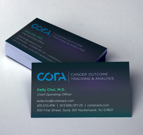
Aviate Creative kicked things off by designing a truly meaningful logo for COTA that represents the remission of cancer, from both a scientific and technological standpoint. The “C” and “O” are linked to represent DNA molecules, and the “T” and “A” each have parts missing to symbolize that remission is in process. It’s a clean, yet impactful representation of COTA’s identity.

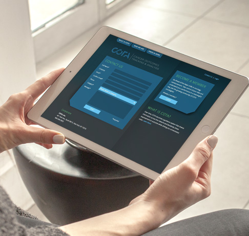
We continued by creating the website information architecture and designing the overall look & feel of the new site, which ultimately resulted in 11 pages of development. The site is visually clean and equipped for easy navigation. The blue and gray color combination creates a sense of authority, professionalism & technological enhancement – which is precisely what COTA represents. An appealing email template was designed as well for COTA to use in its email communications with its audience.
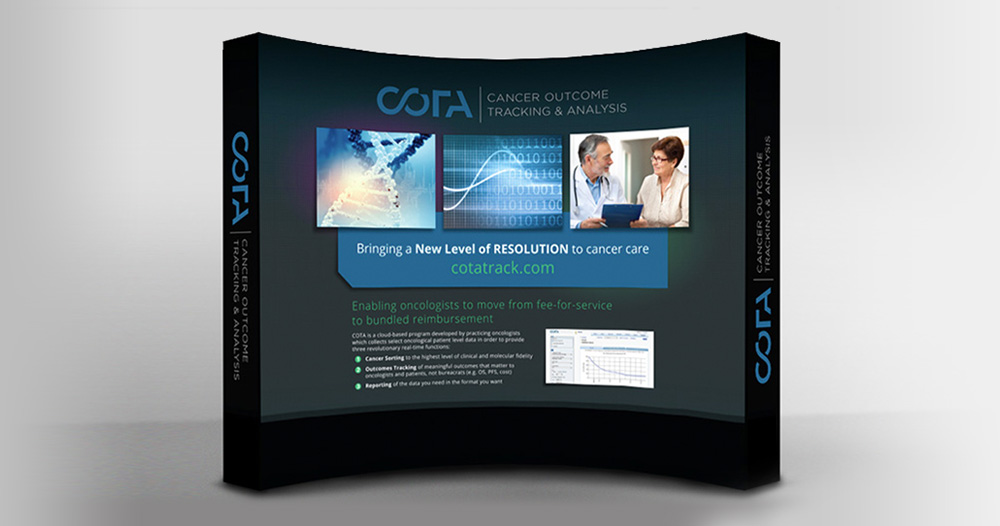
Next, we designed & printed an attractive exhibit booth display for COTA to showcase at the annual ASH event. The graphic designed by Aviate was sized for a 10’ x 10’ booth with end panels on both sides. The booth itself was a concave wall unit geared for easy setup & breakdown. We also printed a white version of COTA’s logo on a 3-sided black tablecloth sized to fit the 8′ table, which COTA used as its ‘meet and greet’ sitting place.
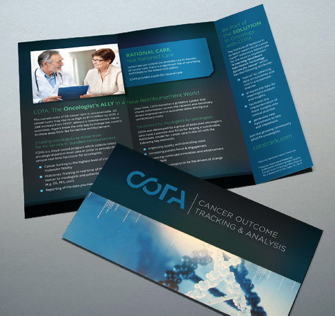
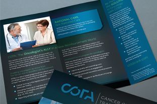
To conclude this project, Aviate Creative designed & printed an attractive tri-fold brochure that COTA distributed at the annual ASH event. Its purpose was to provide an informative summary of COTA’S value proposition to oncologists, and entice them to inquire about securing a membership. The piece was printed in full color on two sides on 100 lb. gloss coated cover stock. An attractive PowerPoint template was designed as well for COTA to use during its presentational efforts.
Aviate Creative genuinely enjoyed working alongside COTA on this launch, and looks forward to further supporting their rational cancer care initiative.
As always, we value your feedback so don’t be shy! You can post your thoughts below. Also, if you like what you see and know anybody who may have a need for our services, then please share this with them and/or have them call us. We’ll be happy to assist. Thanks!